
IdentityRedesign
From a literal aviation emblem to a symbol with room to grow.
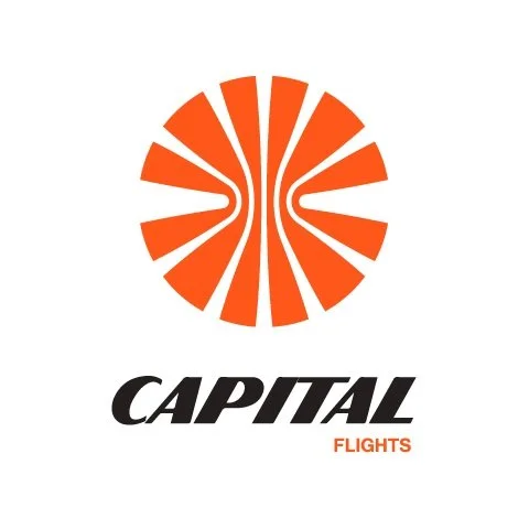
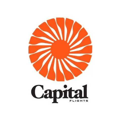
The new mark, wordmark, and flexible lockups give the brand a consistent identity across packaging, print, and screens.

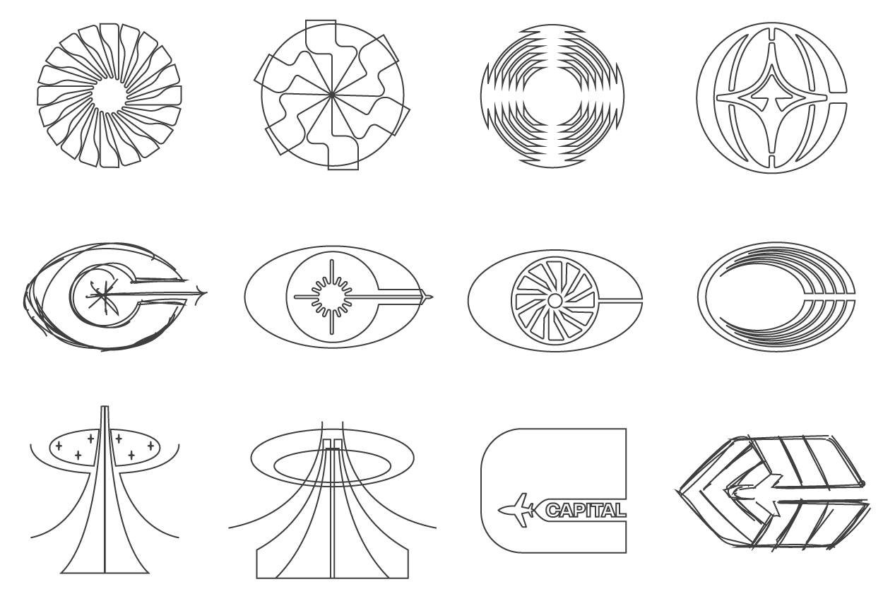
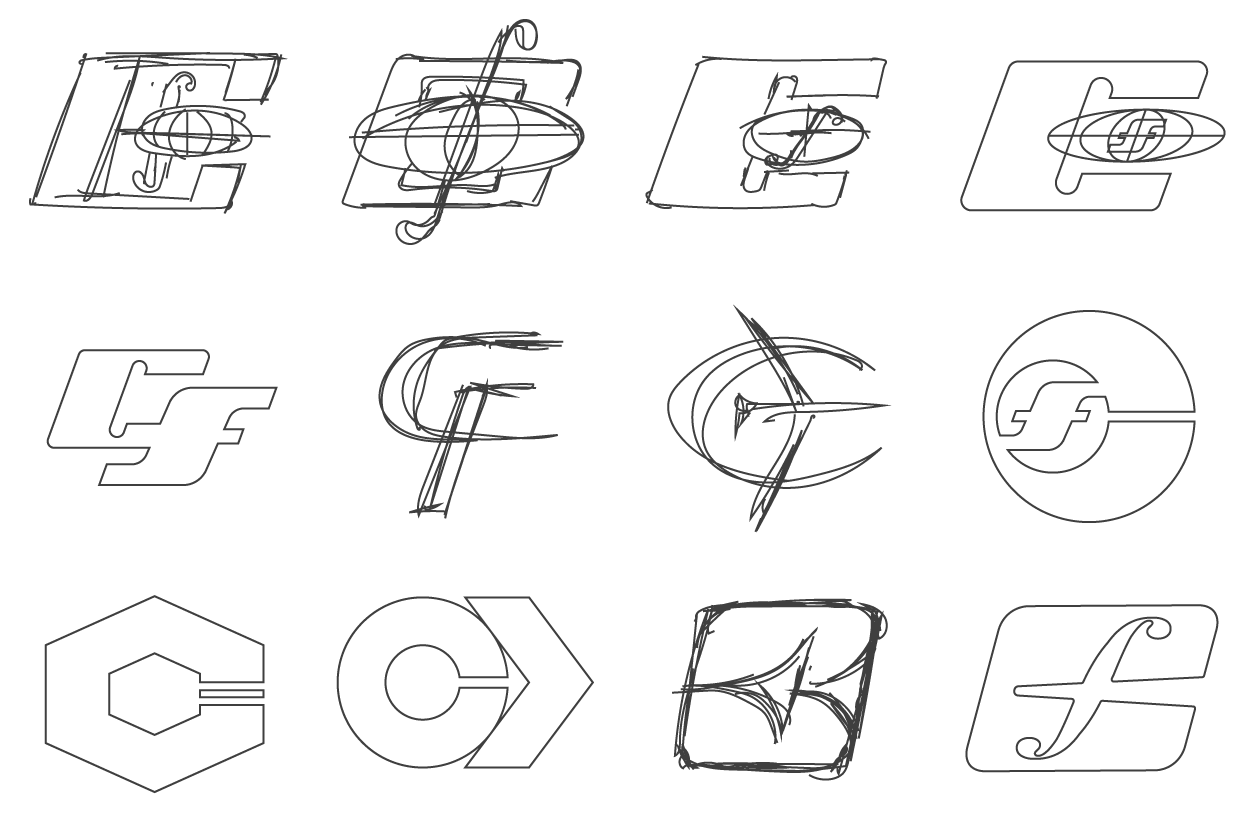


The concept studies bring aviation and natural forms into the same visual language. Turbine blades, flight paths, mushroom gills, and orbital shapes become a series of radial marks, monograms, and wordmarks.
Each direction explores a different balance of movement, clarity, and character. Together, they trace the shift from a literal winged emblem toward a flexible symbol that can work across packaging, print, and screens.
Color &Typography
A clear reading order. Space for the details.
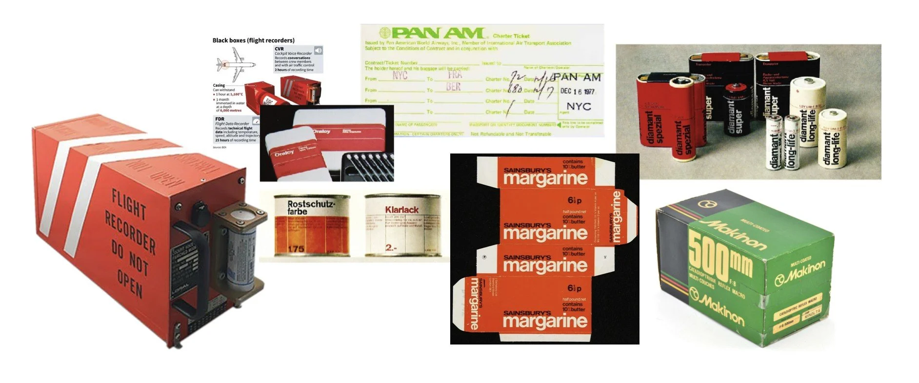
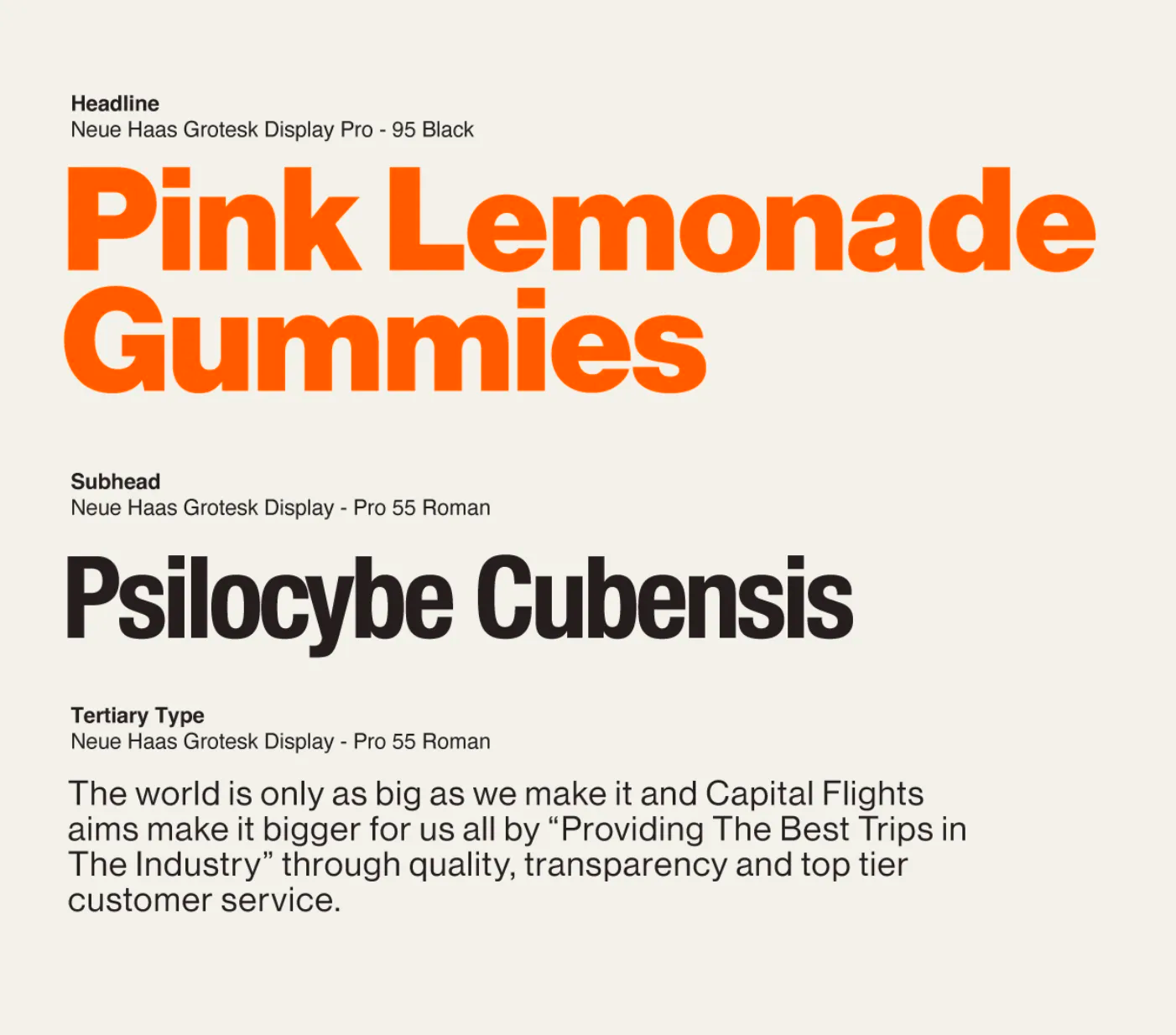
Flight recorder orange connects the palette to the brand’s name. Bold product typography organizes the information, while white space and black type let the illustrations breathe.
PackagingProgram
Natural medicine, through a modern clinical lens.
Capital Flights is a concept identity built ahead of a new market. The brief brings two ideas together: the clarity of a clinical product and the possibility of a personal journey.
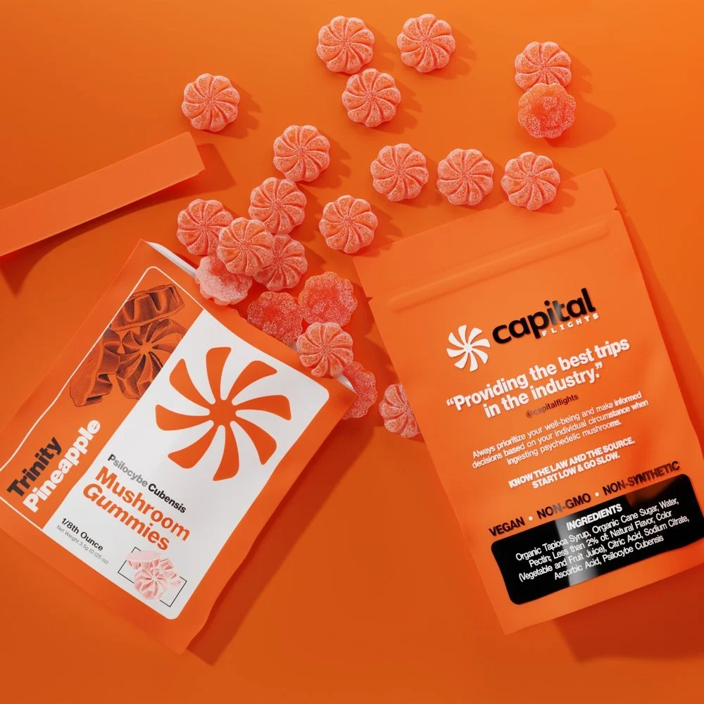
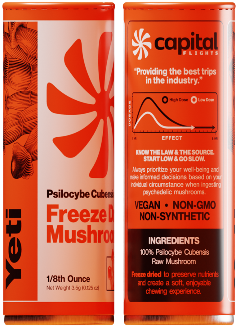
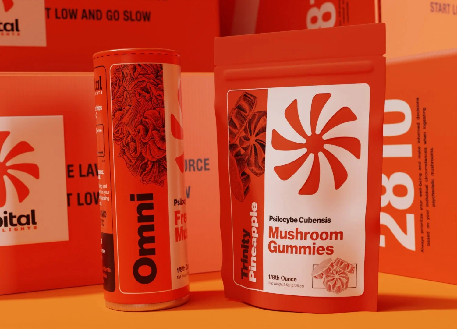
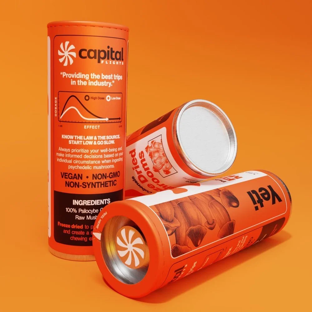
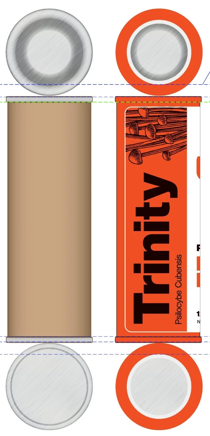
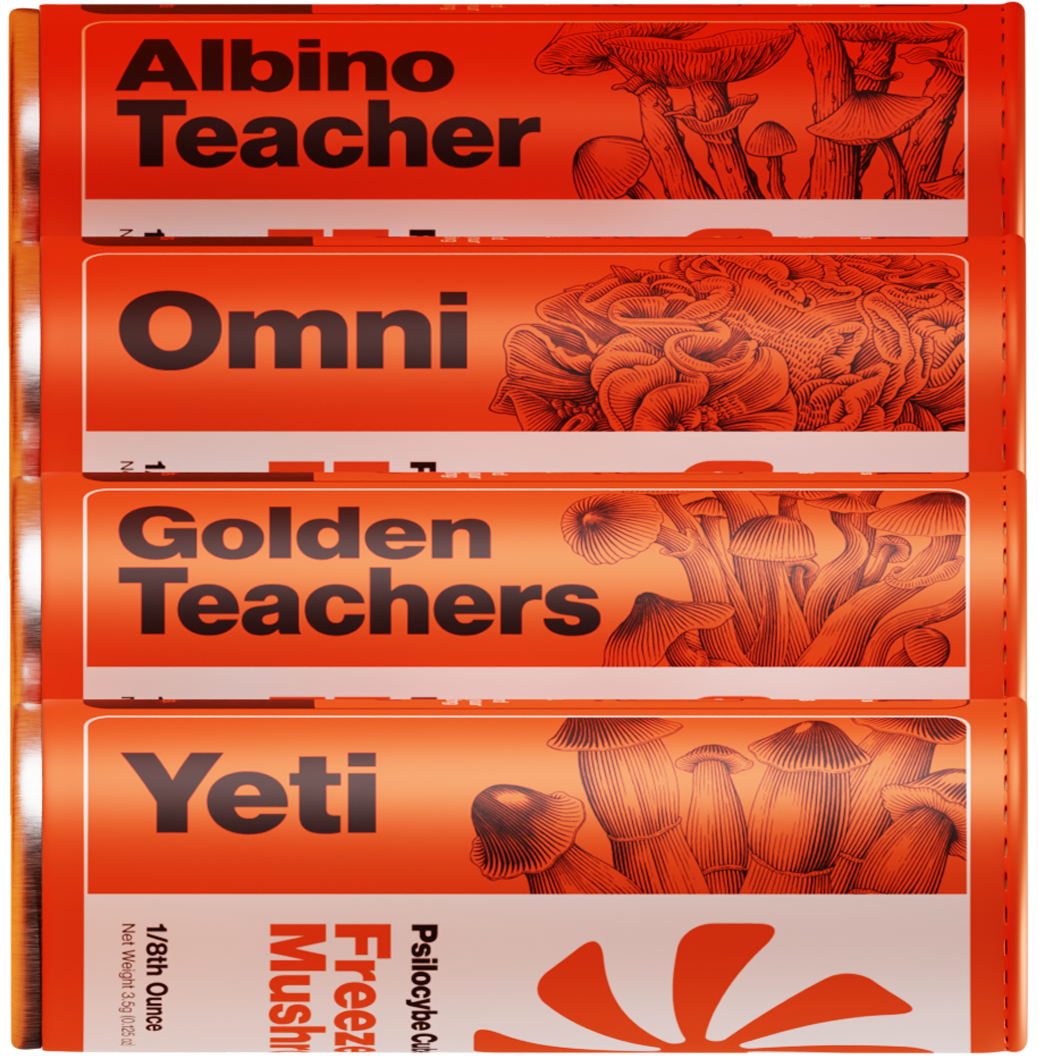
Tube packaging carries the illustrations into a clear, repeatable format. Large strain names establish the first reading point, followed by product details and guidance.
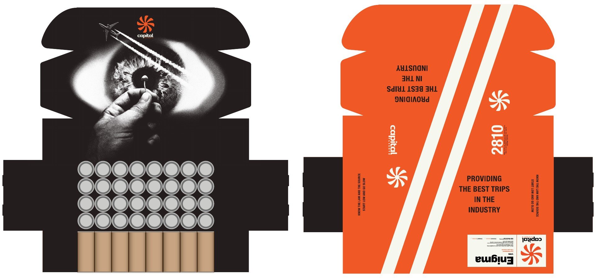
Orange, black, and white connect individual tubes to the wider collection, while the wrap layout shows how the identity translates into a physical package.


Drawn FromNature
Hand-inked illustrations from across the ocean.
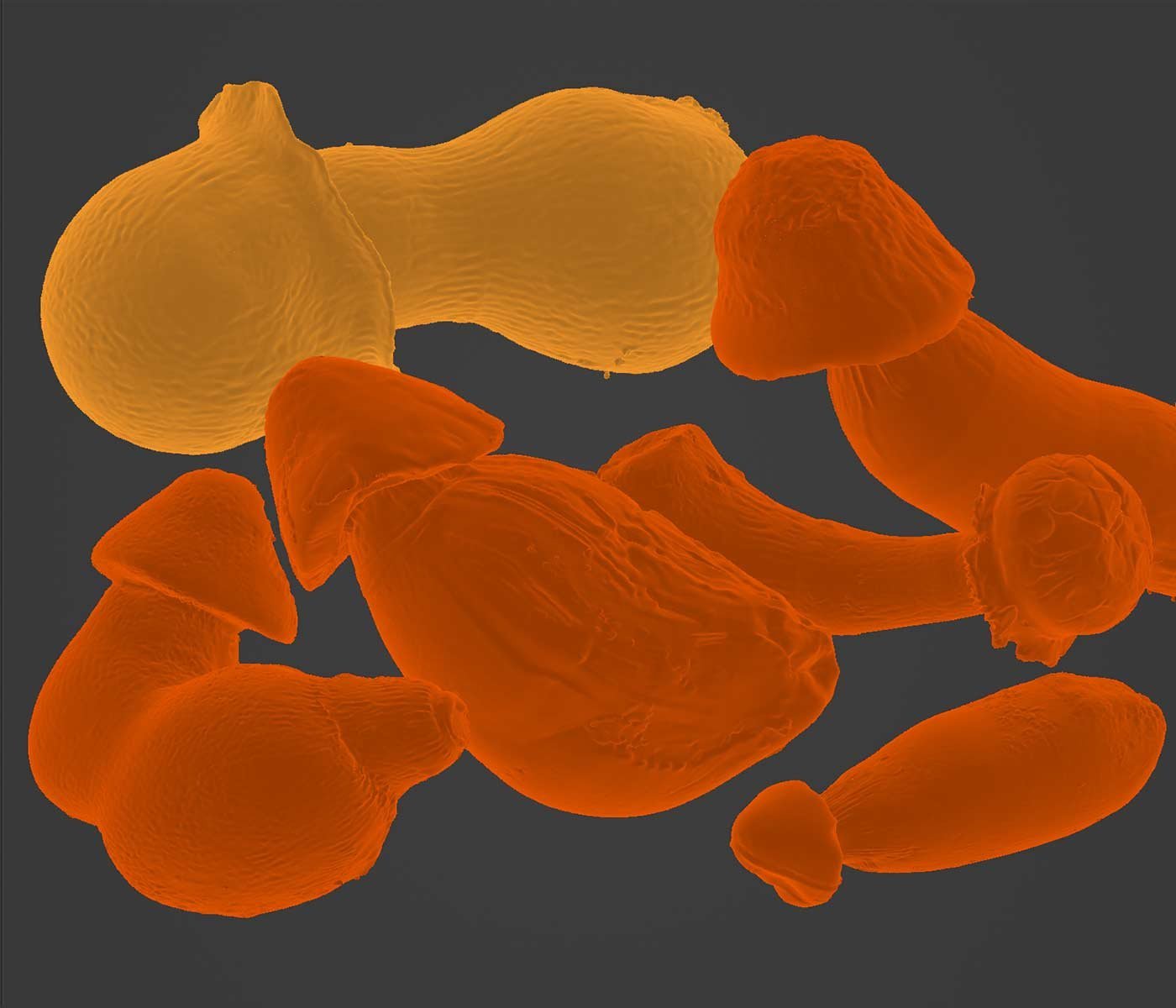
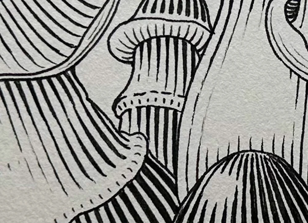
The drawings document the mushrooms while building a distinctive visual language. They were designed to feel at home on a pharmacist’s shelf and in everyday retail.
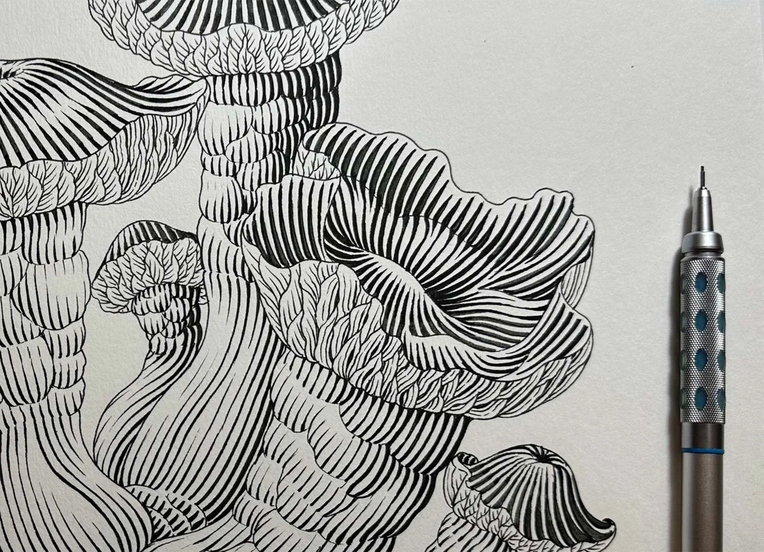
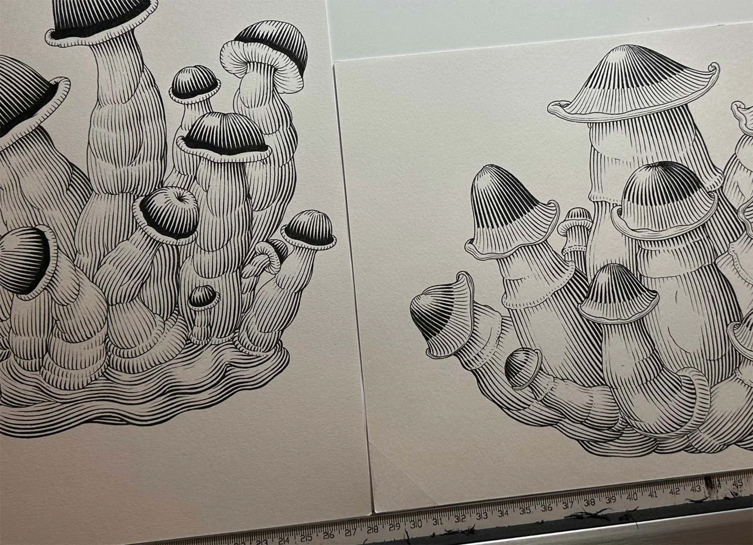
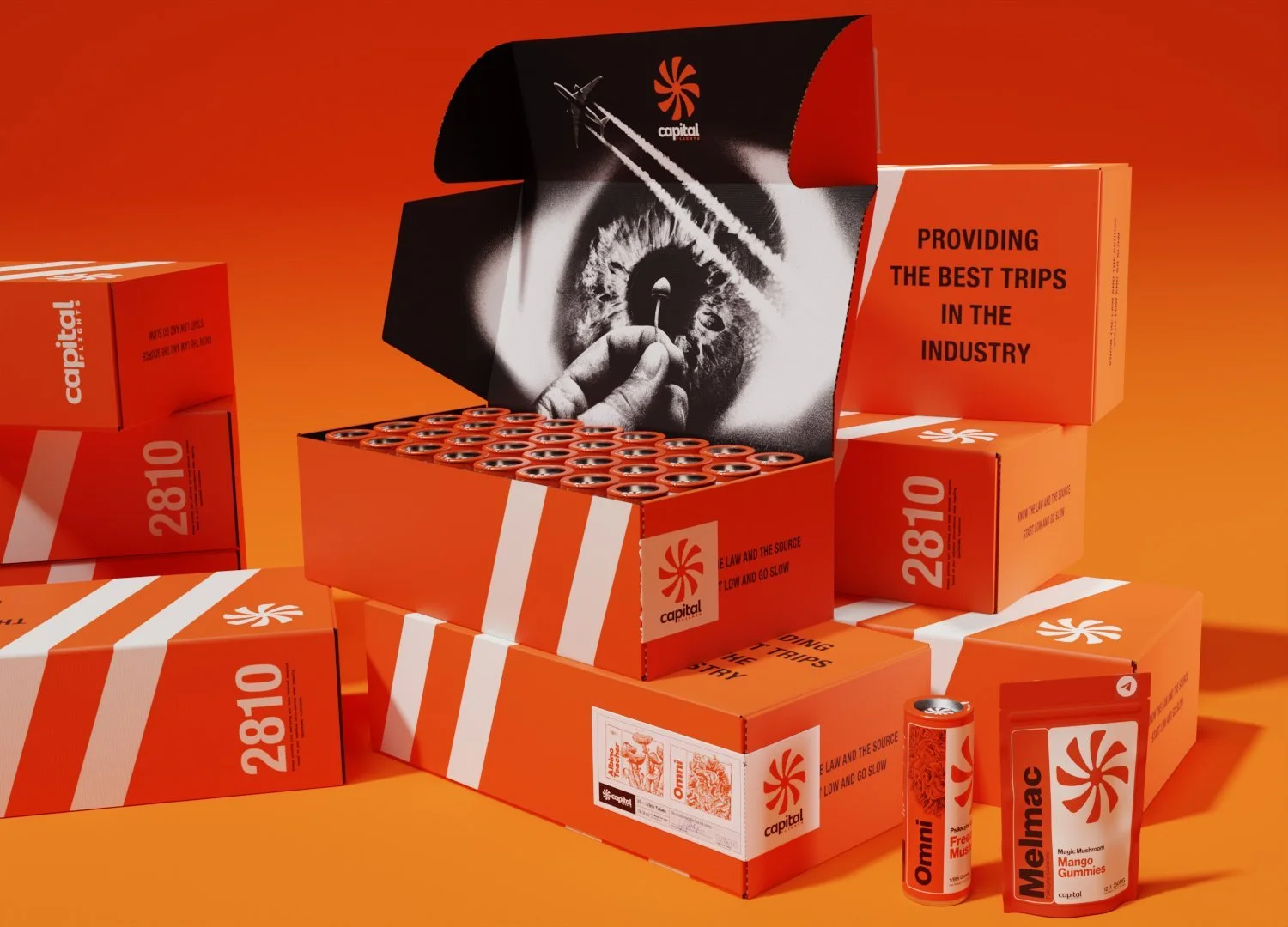
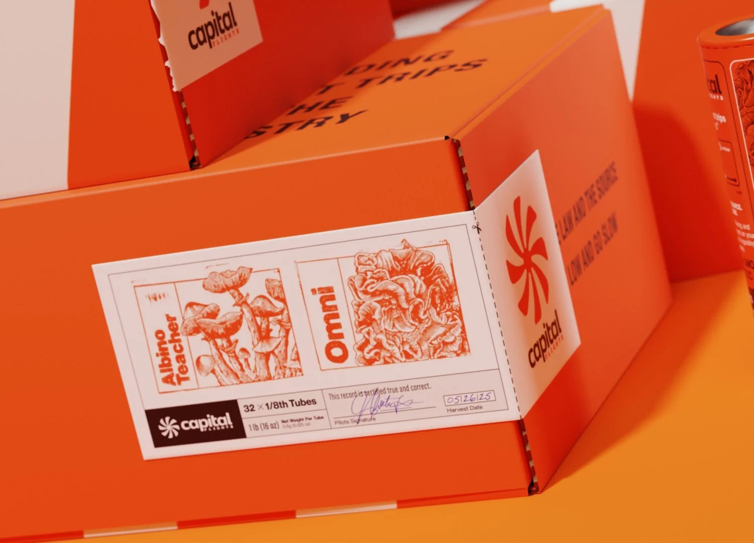
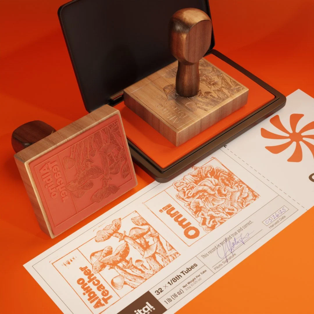
The packaging system continues through shipping cartons, printed labels, and stamps. The mushroom artwork identifies each strain, while a consistent type hierarchy keeps the product and handling details easy to find.
These practical touchpoints use the same orange, black, and white palette, connecting the outer carton to the individual packages inside.
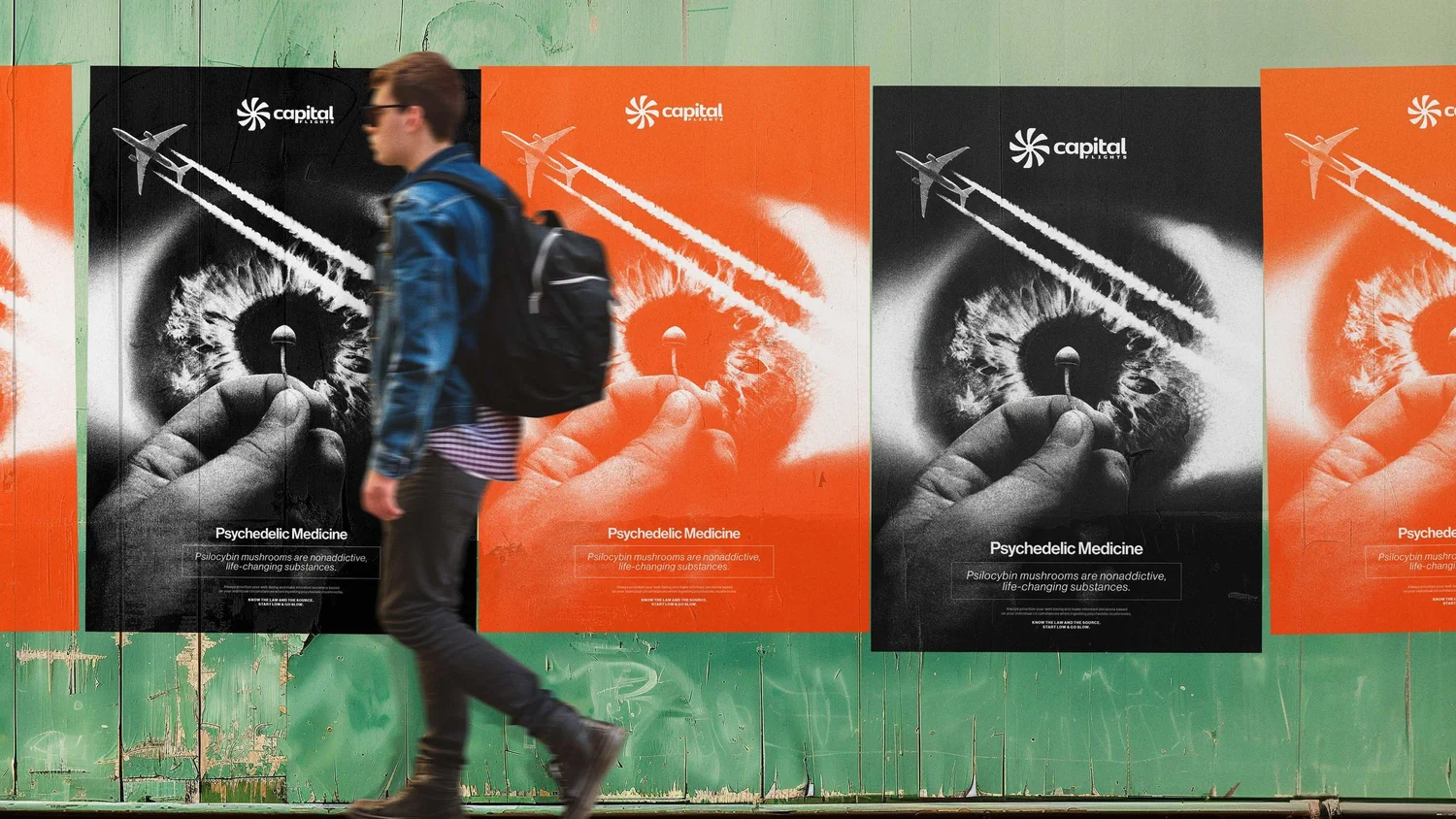
The identity moves beyond packaging through poster compositions and exterior signage. The aircraft, eye, and mushroom bring the idea of a journey into one image.
Orange and black connect these larger applications to the product system, keeping the brand recognizable at a different scale.
Beyond thePackaging
A visual language that travels.
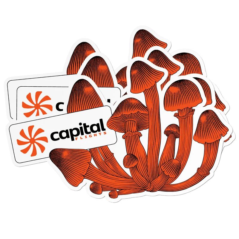
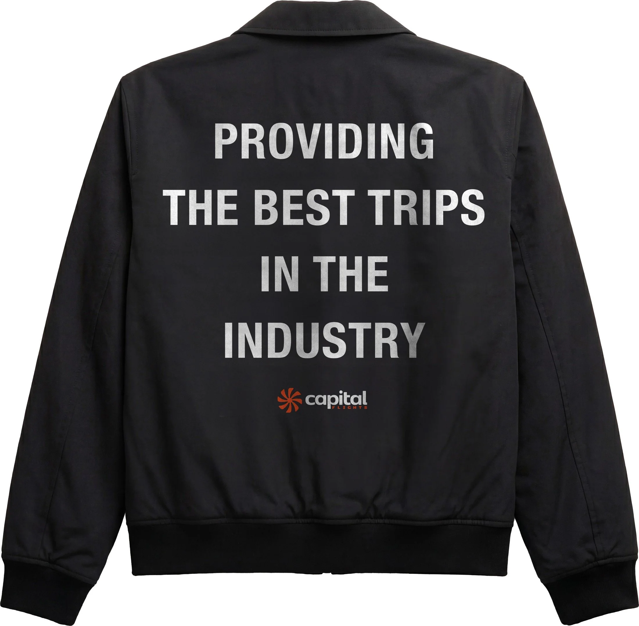
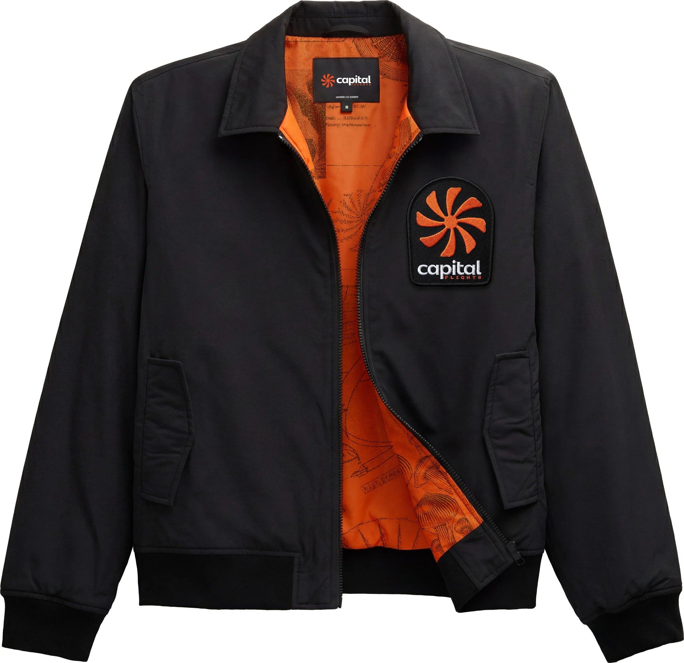
The same mushroom illustrations, bold typography, and orange accents carry into stickers and apparel. These everyday objects extend the identity while keeping a clear connection to the packaging.
RaisingCapital
Presenting the bigger picture.
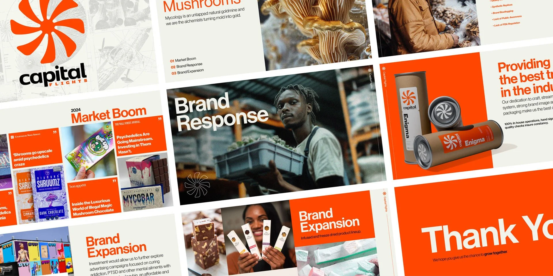
The pitch deck brings the identity, packaging, and brand vision into one presentation. A consistent visual language connects the concept to its potential next chapter.
Awards & Recognition